Tell us about your journey into post-production and becoming a senior colourist?
I studied Television Programme Operations at Ravensbourne College, having spent a year in a darkroom at home developing and printing my own photographs. I thought I’d go into editing, but while working at Framestore (employee number 29) I discovered Telecine and made the leap into colouring.
What piece of work are you most proud of to-date and why?
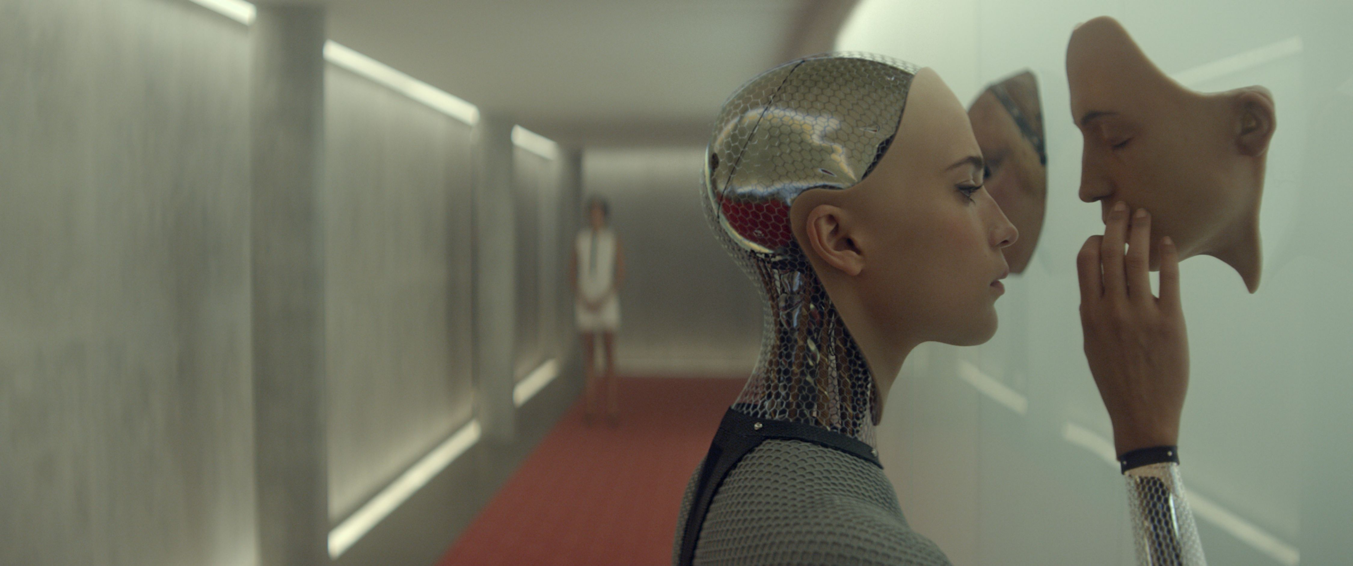
Layer Cake was my first full feature so has a special place. Both DoP Ben Davis and I discovered so much with that film, as we’d come from a commercials background. Ex Machina following The Invisible Woman was an extraordinary experience as well, as both were shot by Rob Hardy but yet were so different in look.
Could you elaborate a bit more on the look for Ex Machina?
Rob Hardy wanted a softer contrast for Ex Machina with subtle golden tones. Shot with smoke in the atmosphere and often through several pieces of glass in the interview scenes we had to find ways to add contrast, or “bite” as we called it, without bringing out any noise in the image.
After several passes we made the grey body of Ava more neutral with some added blue so that she separated from the backgrounds.
What projects have you been working on recently?
The Crown, Tin Star, The Mercy. Obviously, The Crown has been a wonderful production to work on. Beautifully shot and creatively collaborative and having won a BAFTA, it was a really special project.
Is the colouring process different on a project such as The Crown?
Yes, when grading a long series (ten episodes) with two DoPs and four directors, it’s important to have consistency and yet allow for some stylistic differences. It was also important that while maintaining the “look” of the show, we would subtly change the contrast, saturation and colour of any rooms that we returned to multiple times so that we could keep the viewing experience fresh.
Can you tell us a little about your work on blockbuster Baby Driver? How did you decide the look, what were the main challenges for you?
The main challenge for Baby Driver was the number of shots in extremely varied light (chase scenes shot over many days). It took me a week to complete a primary balance pass on my own. Usually this would only take three days.
Bill Pope DoP wanted a natural look and Edgar Wright (the director) wanted some scenes to feel more graphic with various colours “popping out”.
The film was graded in our largest theatre using a Barco projector. I grade viewing in XYZ colourspace, so made this the viewing colourspace. This way there can be no surprises when creating the DCP.
The conform was done in Baselight and multiple re-cuts were completed in Baselight also.
Did you grade the movie with or without the audio?
I always grade with the audio, (at least when with clients and particularly for full run through). This is vital as when viewing a movie mute it can appear darker as the audience are both straining to understand what’s happening and also may look around the frame into a dark area and think they should be able to see detail there, when perhaps we had deliberately darkened it to focus the eye on the characters. In my experience it’s worth approximately two printer points or a quarter of a stop if you don’t have the audio on.
When grading unattended I might listen to music and usually create a playlist for each film. For Ex Machina this was electronic based music from artists like Eat Lights Become Lights’ ‘Modular Living’. For Annihilation it’s been Crosby Stills & Nash.
What about working in HDR?
I’ve now graded two features and a TV pilot in HDR including Dolby Vision Theatrical. I love it. It’s not only visually closer to the real world but offers a greater range of options for storytelling, but don’t think it’s a one button hit; it requires a very careful approach and plenty of time. Just because there’s more detail in the highlights through a window doesn’t mean you can leave this to be brighter; if your lead actor now appears darker in comparison you’ll need to do more windowing work to balance the shot.
How do you usually collaborate with VFX and editorial? Are there patterns or does it change with the project?
We have VFX pipeline and workflow meetings to discus colourspace, LUT supply and re-delivery. It does change with each project but we try not to reinvent the wheel.
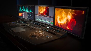
What do your clients like most about Baselight?
Clients often remark that with Baselight, the colourist spends almost all of the time looking up at the screen rather than looking at their display or keyboard. Because of the Blackboard design and the number of shortcuts on the keyboard everything is at your fingertips and you never need to delve down through multiple menus – unlike some other grading platforms.
The clients also remark on how quickly their requests are delivered. For example you can create a defocused vinette in under five seconds and with the Baselight’s gallery system and multiple cursor view you can compare shots from all reels of a film and copy a single component from one shot to another.
How has your role as a colourist changed over the last five to ten years, and how has Baselight fitted into this?
I now tend to be involved from script stage and often grade camera, lens, and make-up tests, also being asked to create looks for the films rather than simply balancing them. Baselight’s evolution and FilmLight’s support with new cameras and deliverables has been a great help speeding up what could otherwise have been costly and time consuming.
What are the biggest challenges you face today as a colourist?
The scale and demands of modern productions coupled with often limited time to perfect onset lighting means we have to work extra hard to deliver a technically correct yet creatively distinctive project every time.
So what do you like to do after you have been in a darkened room all day?
Garden! There’s nothing quite like being amongst natural light and creating a visual feast in the real world. It’s very zen!
If you could have graded any film/commercial/TV episodic/music video in your lifetime, what would it be?
I’ve loved Fargo season two with its ’70s palette. Beautifully graded.
What’s up next for you?
I’m just completing The Crown season two then a couple of top secret films that should be really interesting and visually stunning.