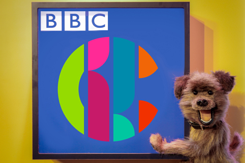
CBBC has undergone its first makeover in nine years after revealing its new logo.
The announcement was made via a blog post published by CBBC controller Cheryl Taylor.
It replaces the green and black logo introduced in 2007.
Taylor said, “We are now the proud owners of a versatile and dynamic logo which works in every space and is designed to appeal to both ends of our broad age spectrum.
“Our old logo just wasn’t devised to perform in a variety of digital spaces which means that it doesn’t work in the way that we want it to today.”
“Our new look has an important job to do in removing barriers and helping us connect to the widest possible audience. It offers a badge of quality that our older viewers can appreciate as much as younger ones.”
It is the second BBC channel rebrand in 2016, following BBC Three’s change of logo in January. Critics claimed at the time that the new logo does not actually say ‘BBC3’, and the new-look CBBC logo appears to have followed suite in that regard.
Taylor admitted that the new logo “is not overt, it doesn’t scream ‘Children’s TV’ but its various iterations are fun and unpredictable and have broad appeal.”
She added that the new logo offered a “colourful and versatile identity that is box fresh and fit for purpose in a mercurial and constantly shifting media landscape.”