Spider-Noir, a live-action series based on the Marvel comic Spider-Man Noir, debuts on Prime Video today.
The show stars Nicolas Cage as Ben Reilly, a seasoned, down on his luck private investigator in 1930s New York, who is forced to grapple with his past life, following a deeply personal tragedy, as the city’s one and only superhero.
Darran Tiernan, director of photography on Spider-Noir, discusses the challenges of creating both a black and white and colour version of the show, and how the production used older lighting technology to create the look of classic noir films.
What was the most exciting thing about achieving the tone of 1930s New York for this show via the camera work?
There were so many exciting parts from the very beginning of conceptualising the look to shooting. Building a 1930s New York that felt rich, lived‑in, and visually “of the period” without tipping into parody. We drew inspiration from the incredible noir films that came out of the classic era, from the early 1940s through the late 1950s, and leaned hard into that grammar of deep shadows, smoke‑filled interiors and off‑kilter framing. With Nicolas Cage as a detective in a Spider‑Man universe, we made the camera work feel both respectful to the genre and very playful which was really thrilling for me as a cinematographer.
What was the most challenging part of achieving this tone via the camera work? And how did this project challenge you differently from your previous work?
The challenge was balancing pure film noir authenticity with the heightened comic‑book energy of Spider‑Noir. We couldn’t just ape vintage photography but we were deeply inspired by the past.
We did both a colour and a black‑and‑white version of the show, which took months of testing between the camera, art, and costume departments to arrive at the right “recipe” that worked for both. Every decision, from fabrics, makeup, design and colour choices, to lighting ratios and lens choices, had to serve two looks at once. We went through countless tests to make sure the image felt strong and intentional whether you watched it in colour or in black and white.
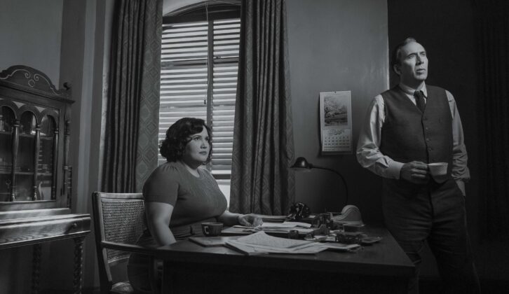
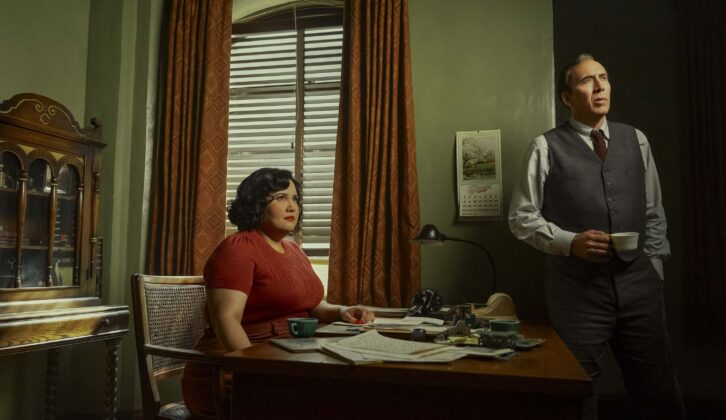
Compared to projects like Perry Mason or The Penguin, this project pushed me to think more expressionistically about light and shadow by using camera and lighting more boldly to exaggerate angles and silhouettes while keeping the story grounded in an emotional and human world.
What were the earliest visual conversations you had with showrunners Oren Uziel and Steve Lightfoot?
Very early on, Oren and Steve talked about this as a noir detective story first and a superhero story second which set the tone for everything. We looked at countless classic noir films and 1930s-40s photojournalism. Focusing on how to age the palette, shape the light and choreograph blocking so that every shot served the mood as much as the action.
Lighting is a very important element of the show, and helps to tell the story. How did you approach working with this to bring the script to life?
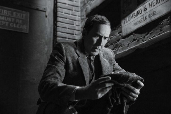
For me the lighting for Spider-Noir was always about psychology first and realism second—we used chiaroscuro to mirror the characters’ moral ambiguity and inner turmoil. In Spider-Noir’s world, light is rarely neutral. It’s either exposing too much, hiding too much—I tried to make every source feel like it was complicit in the story.
It’s important to note that we mostly used older lighting technology that was closer to what would have been available during the time of classic noir films. That helped ground the look of the time and gave us that period quality. We leaned into practicals, softboxes and fresnels in a way that felt familiar to the era, so the lighting itself became part of the show’s noir authenticity.
The audience will have the choice to watch the show in either colour or black and white. How did this affect your camerawork when creating the overall look of the show?
Shooting for both colour and black‑and‑white versions meant we had to design every shot so it worked as a strong noir image first and then as a richly textured colour composition. We treated the black‑and‑white as the “core” aesthetic—building big contrasts, strong silhouettes, and graphic shape and then using the colour pass to reinforce mood rather than distract from it.
We had an incredible body of work to inspire us from the era of noir films, the photography and graphic design of the time. That rich visual legacy gave us a strong foundation to build on while still allowing room to put our own stamp on Spider-Noir’s look.
Were there sequences that pushed boundaries of the noir aesthetic into something more heightened or graphic?
Absolutely. There are set‑piece moments where Spider-Noir’s agility and powers (and sometimes lack of them) let us stretch the noir language into something more operatic and graphic. Those sequences feel like the show leaning into its own genre rules then twisting them just enough.
I often asked myself whilst filming. What would John Huston have done on The Maltese Falcon, or Stanley Kubrick on The Killing, or Orson Welles on Touch of Evil? What would they have done if they’d had a Steadicam, a telescopic crane arm or drones like we do today? It’s a fun thought experiment—imagining how those amazing film-makers might have used modern tools back then while still honouring the same tight, grounded and psychologically driven camera language that defines noir.