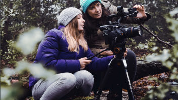
Kampen om Narvik had its theatrical release in Norway in December 2022 and has just premiered on Netflix (in selected territories), as Narvik. Directed by Erik Skjoldbjærg, the film saw cinematographer John-Erling Holmenes Fredriksen work closely with Dylan R. Hopkin, senior colourist at Nordisk Film ShortCut Oslo, to add realism, light, and deep colour to the look and feel of the period drama.
Davinci Resolve’s colour tools were fully exploited to solve numerous challenges around the unique visual look of the film, as well as VFX clean-up tasks, stabilising, adding camera shakes, accentuate the costume, and production design, and even invent a completely ‘virtual colour’ for the main character’s distinctive clothing.
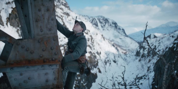
The film is set in 1940, while the people of the Norwegian port city of Narvik, a strategic gateway for the Swedish iron ore for Hitler’s war machine, are threatened by invading German forces. The story centers around the ordeals facing Norwegian army corporal Gunnar Tofte (Carl Martin Eggesbø) and his wife Ingrid (Kristine Hartgen).
“The film is about the Battle of Narvik and its part in the larger war, but it’s also a very personal story about a small family and the impossible choices they had to make under pressure,” says Hopkin.
The film also has personal resonance for the director of photography, John-Erling Holmenes Fredriksen, who grew up in Northern Norway. He wanted to bring this intimate, human story to life with realism and a color palette rarely seen in war movies.
“I found photographs from the period in Life magazine that were saturated and vibrant, shot with medium format cameras on the Kodachrome film stock; I wasn’t used to seeing the war in this way,” says Fredriksen. “It became more real to me, something present. It felt like a good starting point for the look of the film.”
Using photo references from Fredriksen, Hopkin experimented in post, applying colour transformations on digital ARRI RAW files to achieve densities that could reproduce the hue shifts and depth present in the analogue film stock. The colourist worked in cylindrical colour models such as HSV and HSL to manipulate hue, luminance and saturation separately from each other to produce a ‘show LUT’ (look-up table).
The LUT was thoroughly tested before being used in-camera to faithfully monitor the scenes on set during production, applied to all dailies and utilised throughout the final grading.
Playing with light
Resolve was also used for rig removal and, in one case, clone out some of the crew moving a crane across a bridge in the background of a wide shot. But it was in adding atmospheric color, focus, and additional lighting that Hopkin truly showed his skills.
One example was to add flickering light to enhance the illumination on the town’s buildings, ‘created’ by the reflected light of burning ships in the harbor. However, it also had to match the pulse of the on-set lighting created by Fredriksen and gaffer Henning Høifødt, a hue described by Hopkin as “an inferno palette; a sulfur flare feel, dispersed through clouds, with a touch of magenta and red.”
“We started by matching the intensity and frequency of the ARRI Skypanel light sources and then used the Flicker Addition ResolveFX filter, as well as Power Windows, manual keyframing and selective keying,” he explains.
Hopkin also created the feeling of moving cloud coverage on the buildings by blocking the light with hand-drawn cloud-shaped PowerCurve Windows, placing them in the scene with Resolve’s Tracker. “When it comes to shaping light, which helps lead the viewer’s attention to the most important area of a frame, utilising Resolve’s Windows and the fantastic Tracker is indispensable,” adds Hopkin.
Green is the colour
Another striking example of drawing focus was the colour of the main character Ingrid Tofte’s coat. “Erik and I were discussing on a conceptual level what was a good colour for her, what fitted her character,” says Fredriksen. “We wanted something that would stand out as iconic and stay in the audience’s mind.”
After some discussion, the filmmakers settled on a coat that was an organic, mossy, spring green, but this provoked some hesitation from costume designers Karen Fabritius Gram and Bente Ulvik, as most of the soldiers’ uniforms were also in shades of green, and they were afraid the colour wouldn’t stand out.
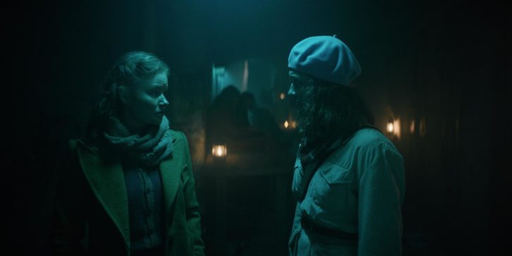
Camera tests with various fabrics led to disappointing results, as the nuanced digital camera couldn’t help but subdue the colours. With time running out, an old jumper found in a thrift shop produced the exact look required. However, to find this random fabric and turn it into a coat seemed impossible.
“A crazy idea came to me,” recalls Fredriksen. “I asked Dylan if we could put her in a coat made of green-screen material, shoot it and then isolate it out to apply the [exact] colour we needed. He said yes, in theory, we could.
“Then I asked if it was possible to incorporate this into the LUT,” he adds. “Because then I’d have a live preview of the coat on set instead of shooting a harsh green-screen coat and having to tell everyone we’d fix it in post.”
However, encompassing this into the show LUT was not just a case of keying out with a simple colour picker, since keying is not a fully supported operation that can be stored properly within a LUT. Additionally, the ‘fake coat’ had to appear in a wide variety of lighting conditions and environments and stand out among other shades and colors.
Hopkin experimented with alternative colour models to achieve the desired effect and successfully integrated the effect into the show LUT.
“In Resolve, you can decide within each correction node which color model you want to do the processing,” he explains. “So, on one node, I was doing work in RGB, and then on a neighboring node work in HLS or HSV. The choice of colour model depended on which creative result I wanted to achieve. There were a lot of iterations.”
“At the camera rental house, we put the green-screen coat on the actress, and I walked around her, shooting handheld,” says Fredriksen. “I had the costume designer and the director there, looking at the monitor, and they could see that it was seamless. It was an amazing experience.”